I’ve never receiced any email from Tumblr but this is expected (sigh). It seems most of my previously flagged posts are de-flagged but I’m not sure whether they will lift the Death Mark even if I do go through the trouble of checking all my posts.
標籤: Anonymous
Nope, that looks like Spider-Man and His Amazing Friends from 1981. The one I was referring to was Spider Man the Animated series from 1994.
OK, now I’m watching it.
WHY IS EDDIE BROCK A BRUNETTE I CAN’T ACCEPT THIS LOL

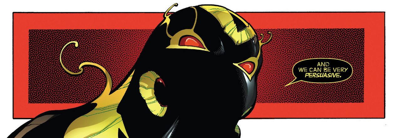
Hi, Flash XD

Hello, symbiote cells (why are u pink?)

This thing

Is more powerful than an electron microscope… okaaaay

Hey here’s my goo babe

kinky

Good Lord


When cartoon Venom has Tom Hardy’s lips

Hmmmm bubble butt

Have you seen the 90’s animated Spider Man series and the inexplicable red shading they gave Venom?
No. Do I need to watch it?
Is the cartoon this: https://www.youtube.com/watch?v=5Zg4JKLccBQ
There’s art that is technically well-drawn, but not very aesthetically pleasing to look at. Simon Bisley comes to mind.
I used to buy Heavy Metal magazine because I love pin-up art and his works look great in that genre, especially the mix of post apocalypse and traditional fantasy vibe. I don’t know he do “main stream” comic too.
Batman Judge Dredd
does look more like the style you’ll see in the Heavy Metal magazine, the comics in it are usually very stylish and more like painting (?) less then the Marvel or DC comic style. But I don’t actually read western comic except the Transformers ones so I might be wrong.
I’ll say, if I all I want to do is look at some pretty art I’ll buy an artbook. Comics I read because I want a story. If the story is completely rotten I can’t enjoy the artwork no matter how good it is. I’ll present All Star Batman & Robin as a predicable example. Good art, rotten to the core writing.
I think so too. If the story sucks, there’s only that much I can stand.
Google search told me
All Star Batman & Robin
is the worst comic ever lol
They say good writing can save bad art. I think there are exceptions to that rule.
Vice versa. Though I can stand good writing with bad art more.
Humberto Ramos’ ‘art’ in general is just so eye-gougingly hideous.
Google search tells me he only draws 1) Gorilla Male 2) Stick Male 3) Stick Bubble Boobs Female
Humberto Ramos turned Eddie Brock into an apeman and it hurts my eyes.
I don’t want to remember it. The Horror.
Would you agree that the overly detailed and cluttered Bayformers aesthetics gets even more ugly when applied to comic book art?
Yeah, it doesn’t work well unless the artist simplify the lines and “details” (more like junk pile parts than actual details to me). I think the movie comics that take place on Cybertron look better because the artists can make them still look organic and complex without looking like something made by throwing glue and junk metal in a blender.
The new Bumblebee movie design looks less broken so I’ll see what it brings us.
